A collaborative human-centered design project with Brianna Fill, Nicole Dee and William Clift.
(Please view our presentation at the end of the page)
After brainstorming about the issues within our community in NorthWest Arkansas (NWA), we narrowed it down to the topic of food and healthy eating. Our interest in this topic led us to a few questions such as the availability of healthy food, how income affects healthy food choices, and how busy schedules can determine eating habits.
These questions led us to our first How Might We question - How might we introduce healthy lifestyle habits to lower-income/marginalized groups and make them more affordable and accessible?
From there, we went into our first phase of research which featured literature review, stakeholder maps, and the fly-on-the-wall exercise.
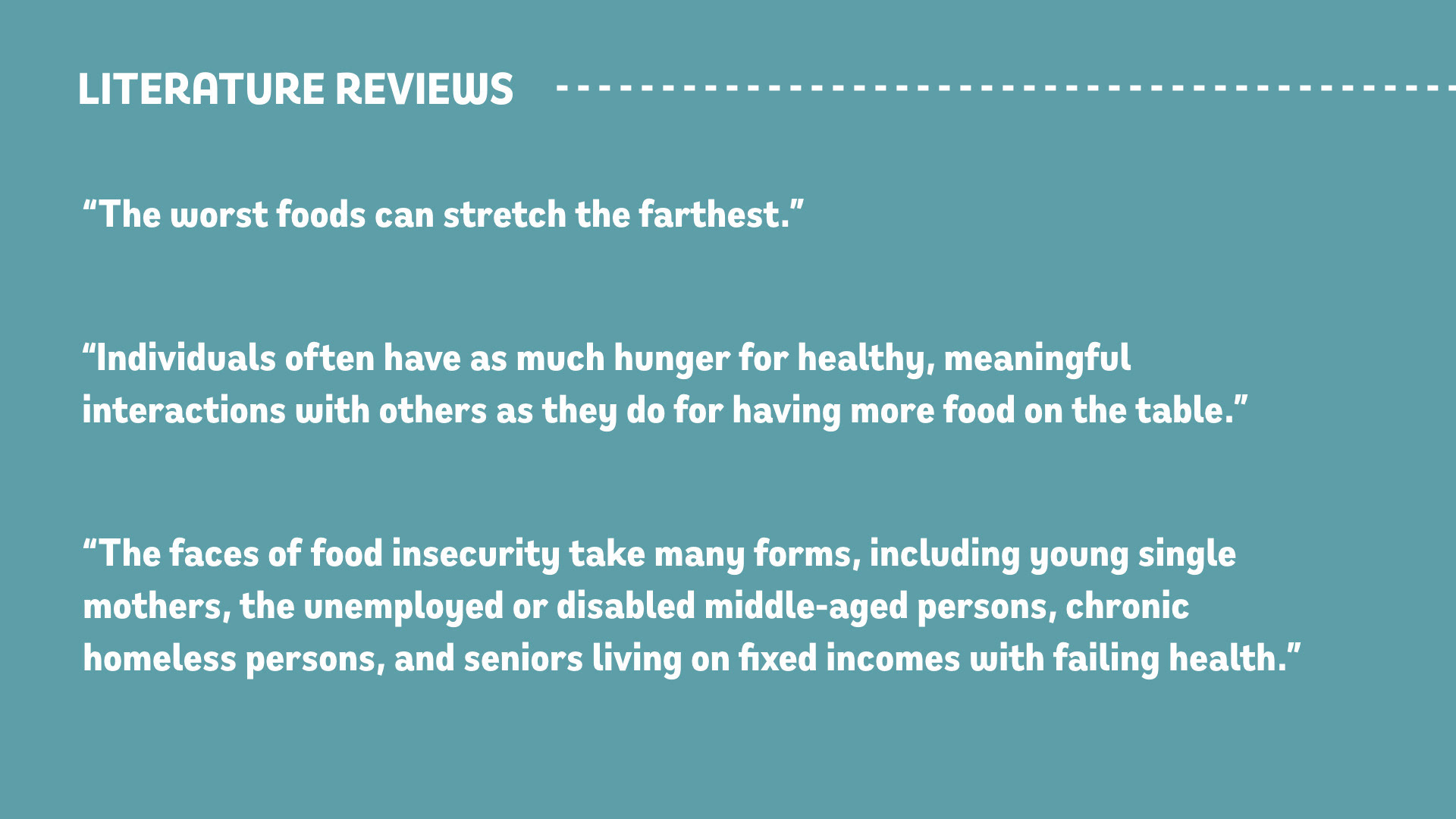
Literature reviews: After diving into our literature reviews, it helped defined our user groups to low-income populations and marginalized groups; these were the people who were being affected most by food insecurity.
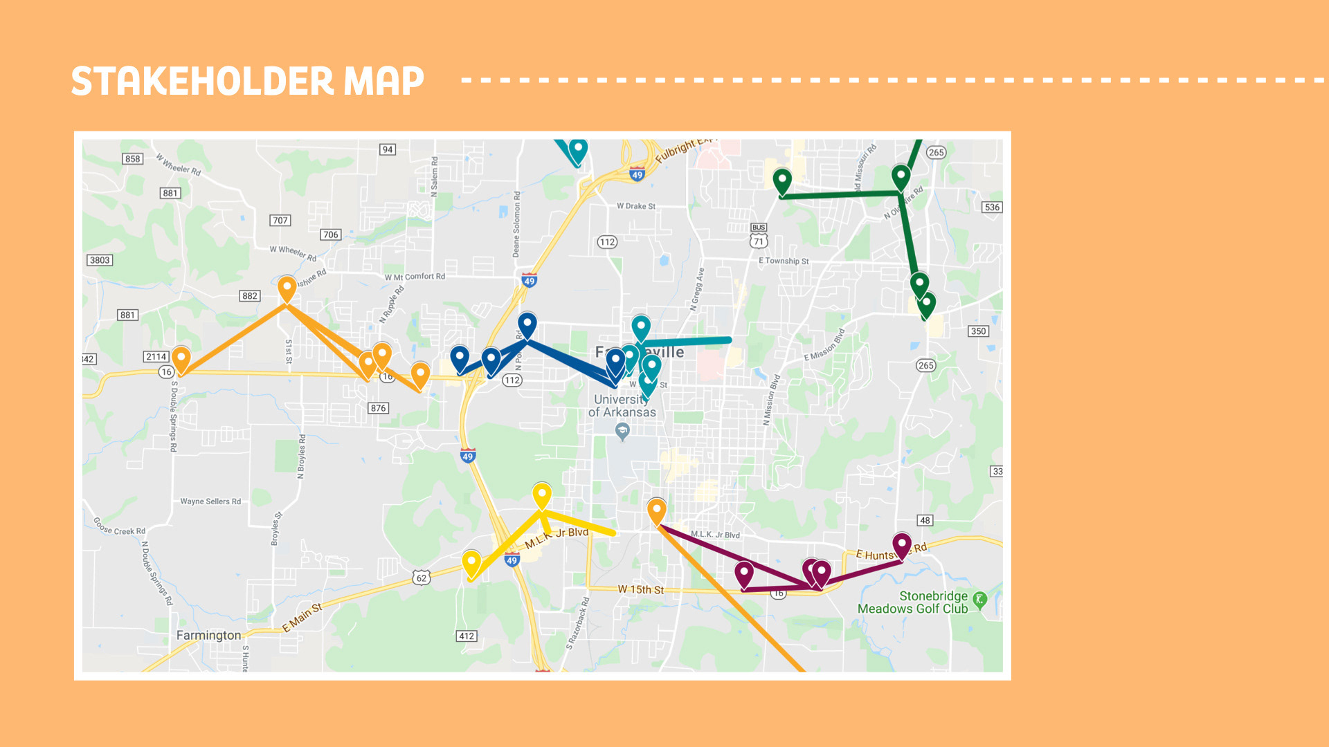
Stakeholder Maps: As NWA is such a wide area, we needed to further narrow down our focus area. Based on our research, we found that Springdale has one of the higher populations of low-income residents.
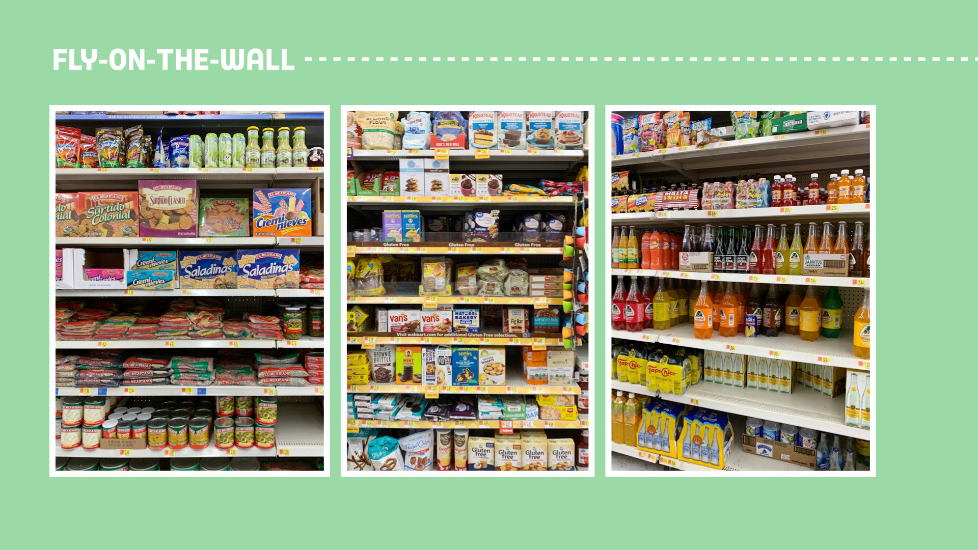
Fly-on-the-wall: Lastly, we performed the fly-on-the-wall exercise. We had gone to a couple Walmarts as well as other grocery stores in Springdale and took notes on things like the store layout, common items in people's carts, and the demographic of the store.


After looking through all of our research from Phase 1, we determined that the problem we had decided to take on had a scope that was a bit too large for our timeline and resources. Unfortunately, issues related to nutrition are inextricably tied to government and money, and we, as college students, don't have the power or resources to be able to get the funding we need to solve this problem; however, our research and observations did give us the inspiration to focus on a new user group: students! This realization led us to the development of our new How Might We question:
In our second phase of research, we worked directly with voluntary participants. We conducted an open ended interview, asking questions like:
- What are the most common items on your grocery list?
- What are your usual orders at restaurants?
- When you were little, what were your eating habits like?
We quickly realized that the participants we had were at ends of extremes. We had: the vegan socialite who works long, weird and inconsistent hours, casually vegan and is always socializing and eating out. The hot dog connoisseur who had vague knowledge about nutrition, generally ignores said knowledge and snacks and socializes a lot. Lastly, we had the allergic wonder who is allergic to gluten, soy, dairy and corn. They are then forced to cook every meal from scratch and even has to bring their own food while eating out with friends/family.
Because of these extreme users, we soon figured out that we were missing the vast shared human experience for food. Hence, we also sent out an anonymous Google Form to willing participates to gauge more insights. With our original three participants, we did a card sorting exercise as well as having them take photos of their personal interiors. From the information gathered, we created a stakeholder map to that could place factors on what people could eat.
We then also plotted it on David Rose's audience receptivity gradient and decided that the best audience that we could help intervene are those who are ready to hear and learn, accepts facts, has an opinion, and are ready to act on opinion.
After the research process, we returned to our How Might We question - How might we educate and empower college students living off-campus to incorporate healthier food choices into their diverse lifestyles? We realized that there are three key factors that affect a student's decision to eat - convenience, social motivation and awareness (or lack thereof). We then developed a user journey that reflects the user's food journey.
Looking at our user journey as a whole, we realize that all our participants have one thing in common - the grocery store. And hence we developed a speculative solution/program to combat the issue. The program would incorporate a color-coded product system (where products would be color-coded based on their nutritional values), a grocery list sharing platform (helping people stay on track at the grocery store), and a point system (that awards the users points when they try a new healthy food and subtract points when they give in and purchase an unhealthy food option).
ARTIFACT #1
This then leads us into our design strategy and the artifacts that we are proposing. The first artifact is an app that acts as the grocery list sharing platform. Users can sign up for an account which keeps tracks of their lists, points and discounts and badges that they could earn. They could easily download a list from their favorite health food influencer or publish their own lists to earn points. And at every point milestone, they are awarded with discounts that they could use at the grocery store and at major milestone, they would earn a badge that they could proudly present on their social media platforms like Facebook, Twitter, or Instagram.
ARTIFACT #2
The second artifact is an innovative cart technology that would be implemented in the grocery stores. This cart features a new handlebar that you could hover your phone over, and it would log you into your account! This syncs up your account's lists and points into the cart and the cart would check off any item in your cart off your list and flag any item that is not. To easily visualize the nutritional value of the food items in your cart, the cart uses holographic technology where when the button is pushed, a holographic image is shown indicating the color code of each product and any flagged items that may be in your cart. During the checkout process, the cart would also sync up your account's data into the register so that you can easily use any discounts that you may have earned.
ARTIFACT #3
The last artifact that we are proposing utilizes the color coded product system proposed before. During our research process, we noticed that stores like Aldi's have a lot of control over their packaging. Hence, we are proposing a complete redesign of all their products to incorporate the color coded system on the packaging - making it really easy for consumers to see their food's nutritional values. We would also update the item's barcode which would then complete the system by allowing the packaging communicate with the cart and the cart to checkout.
Changing students' grocery shopping and eating habits is a big challenge and doesn't involve a quick and easy solution; however, after in-person research and realizing that many students have a desire to make healthier choices but just aren't really sure how to do so, we believe that there is a solution out there. Our design strategy, although imperfect and just in the beginning stages, is a step in the direction towards a hopeful and efficient solution. And maybe in the future, we will revisit this proposal and further our research and proposal to further heights.
