
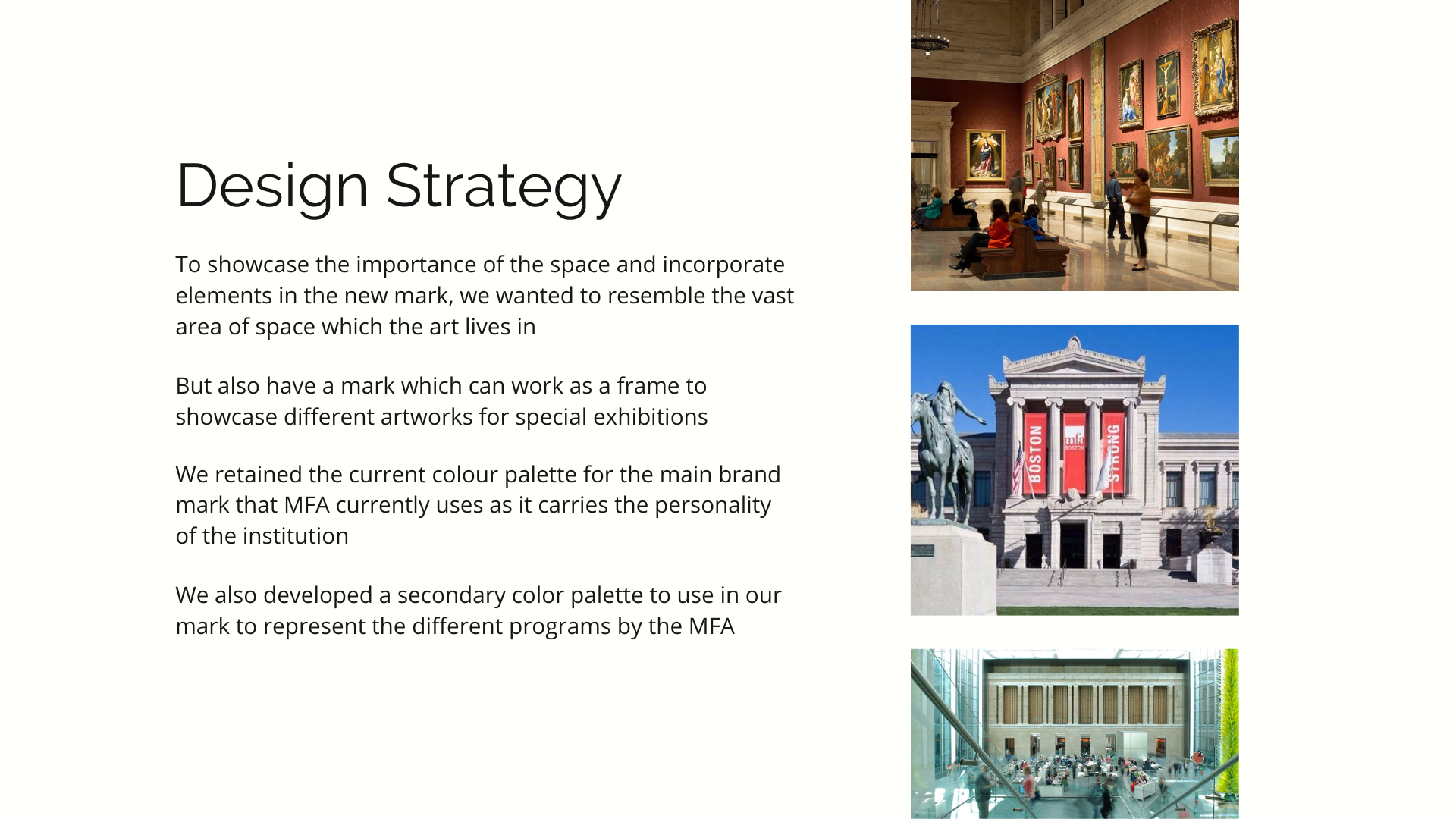
A group project reimagining the look and brand for the Museum of Fine Arts, Boston. While the project did not end up being selected for MFA's rebrand, it showed dedication, passion and team-work from my cohort that shared the same interest in design as I do.

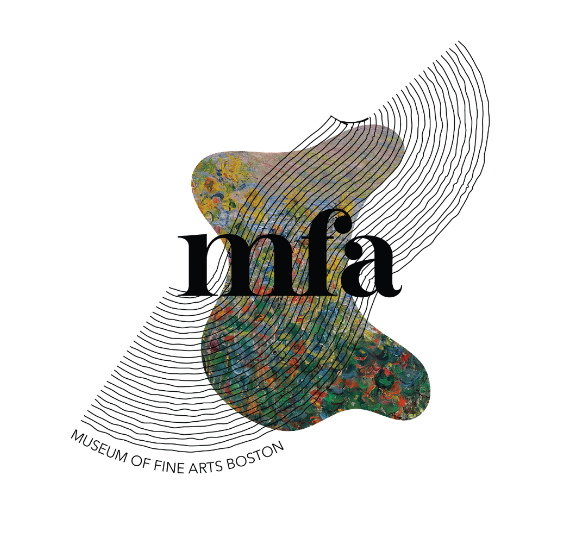
A brandmark is a representation of an institute's journey and history but it also involves the future that's coming ahead of us. For this new identity, we wanted to have a mix of modern and classical graphic design styles and showcase diversity through the mark to symbolize all the different art styles that the MFA represents. The above shows the current MFA mark next to other competitors.
Proposed Brandmark
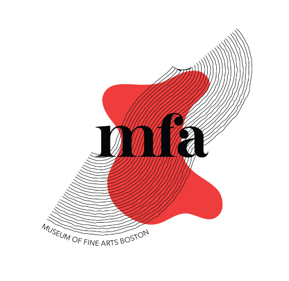
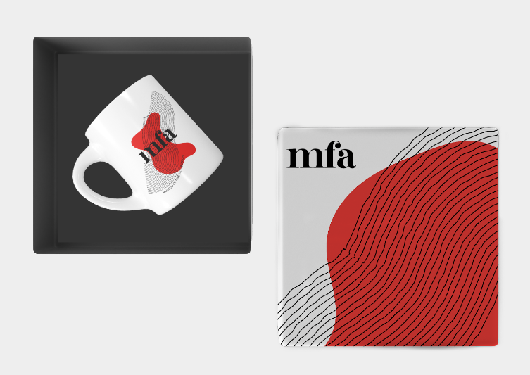
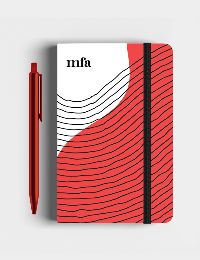
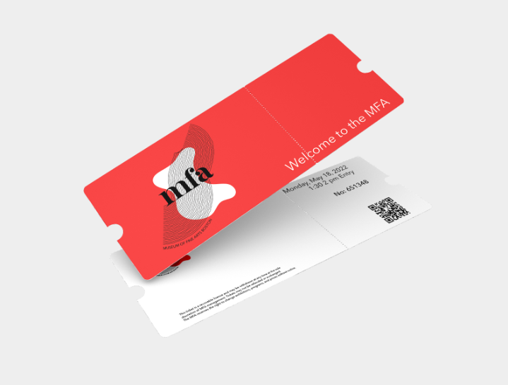
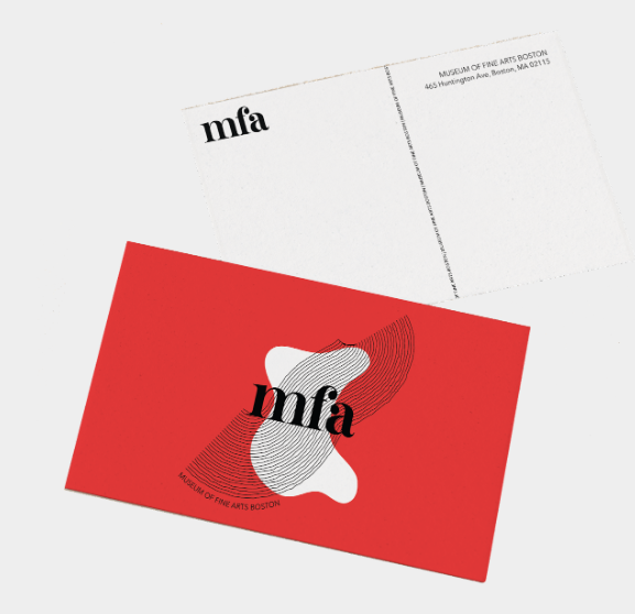
Its shape represents the LAND area of the MFA and diversity among artists; Lines to represent the guidance and interaction between special programs + new generations ; Buttershine font to make it modern yet classic, reminiscent of the old mark style.

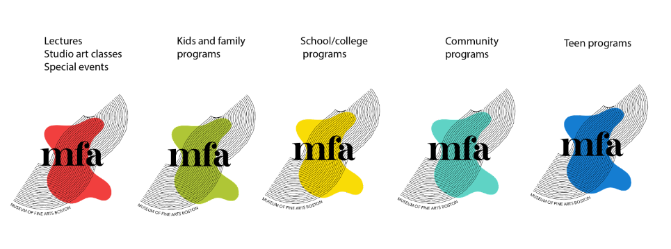
We also chose to utilize color to separate each program category the MFA offers, with the red mark being the main identity.
Animated Mark
The proposed mark is modern, yet classic. It holds the duality of art and design; making it a worthy competitor amongst other well-known museums around us.
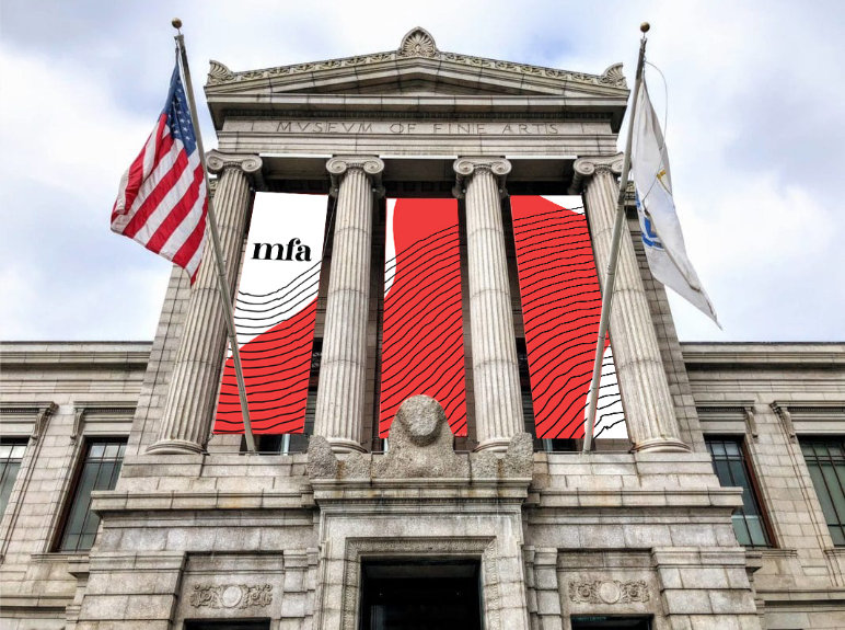
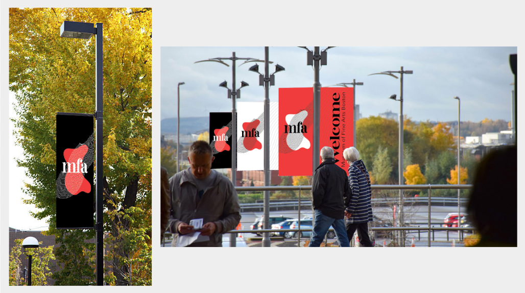
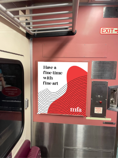
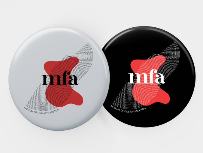
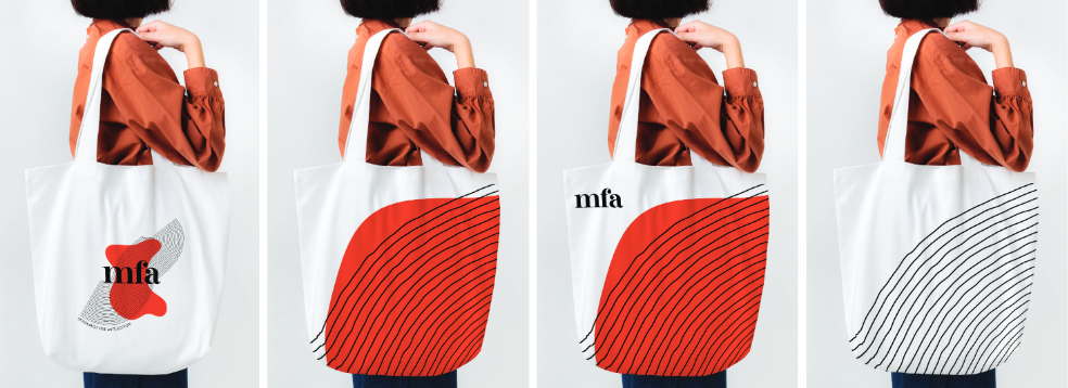
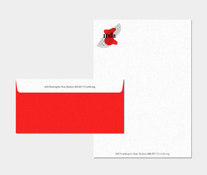
Mark in Use


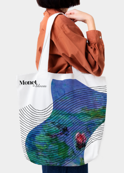
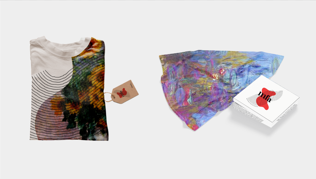
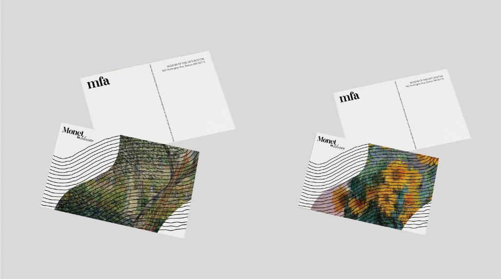
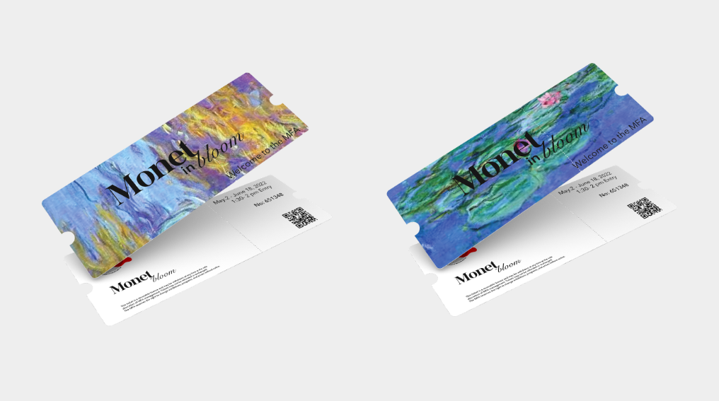
Special Exhibits


Website Design